Project

Allied eCommerce Store

Role

UX/UI Designer – Discovery, user research, design, testing, and design handoff.

blog-post-image

Background

Allied Group, a global manufacturer and distributor of industrial fittings and piping, had a functional online store — but it was falling short in usability. Customers reported a frustrating shopping experience, particularly during checkout and product selection. These issues were causing high drop-off rates and impacting conversions.

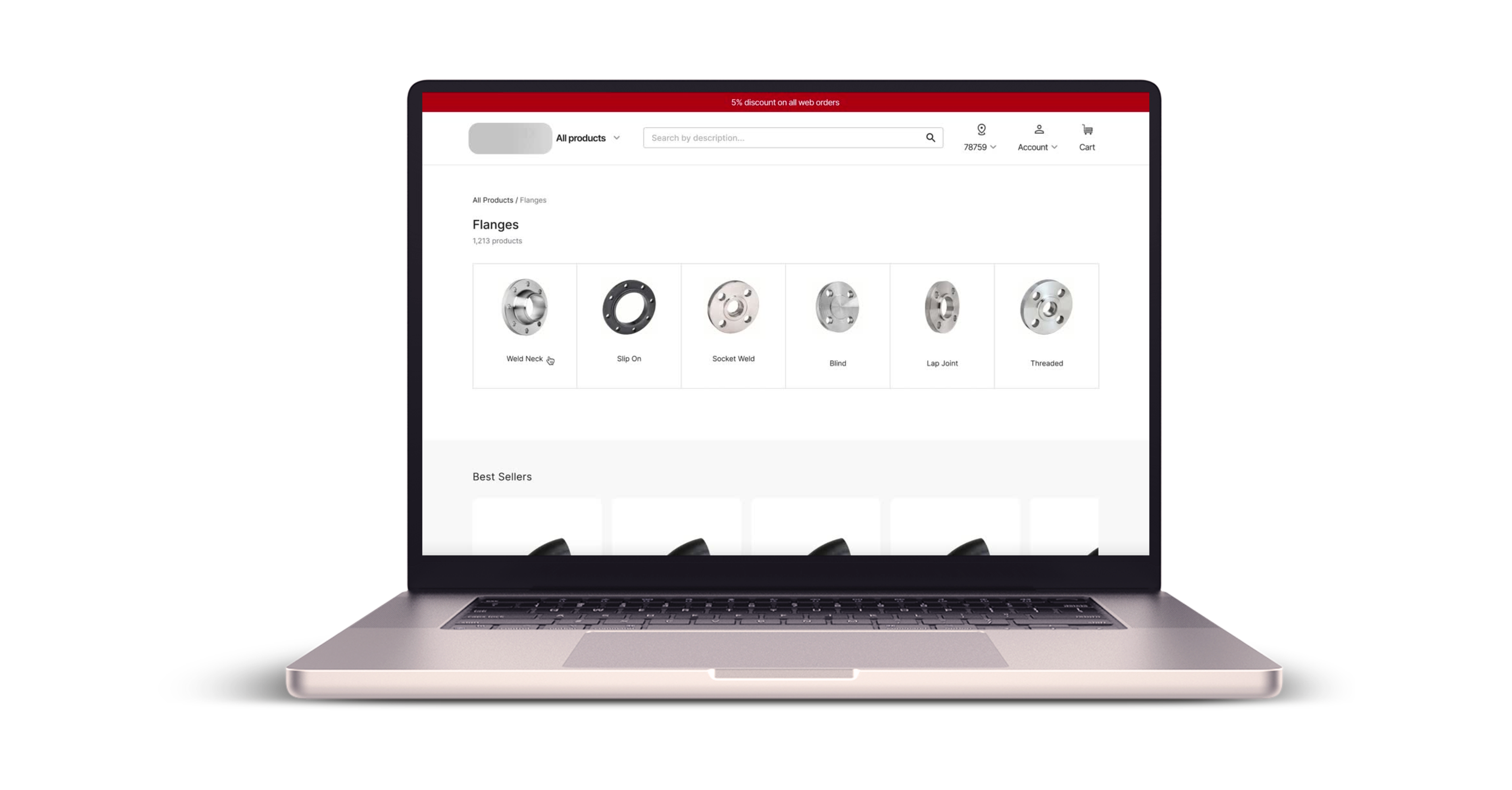
The project was a full redesign of the eCommerce experience, with the goal of improving site structure, streamlining the checkout flow, and creating a more intuitive purchase process tailored to repeat B2B buyers.
View eCommerce Store


My Contributions

I led the full redesign of Allied Group’s eCommerce store, including site structure, customer account pages, product discovery, PDP, and checkout. Through research and journey mapping, I uncovered key friction points and rebuilt the experience for efficiency and clarity. I designed modular components in Figma, validated flows through testing, and partnered with developers and stakeholders to ensure a smooth handoff.

Problem

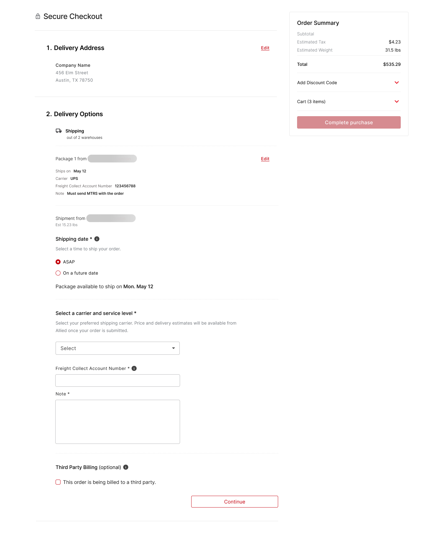
A complex checkout with multiple warehouse and shipping selections caused cart abandonment and frustration. The client needed a faster, more efficient solution for B2B buyers.

01. Complicated Checkout Experience

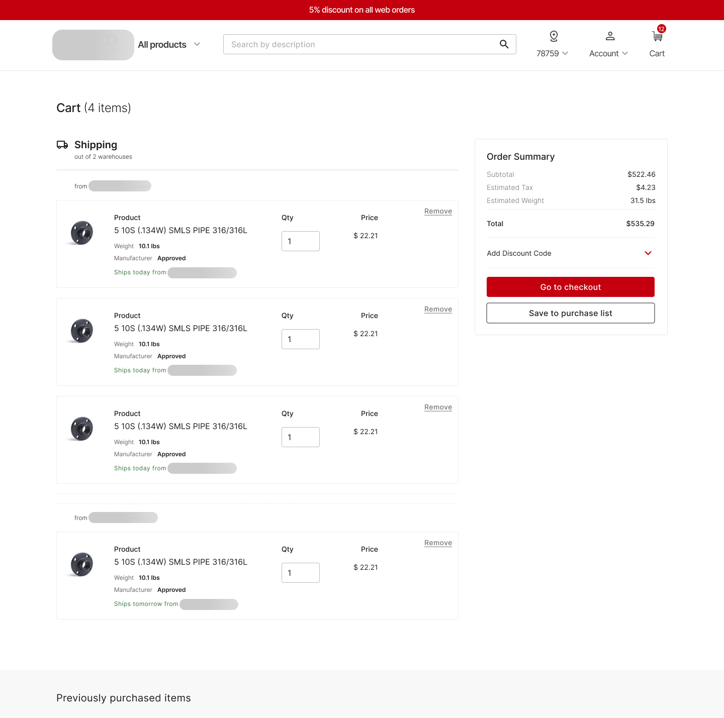
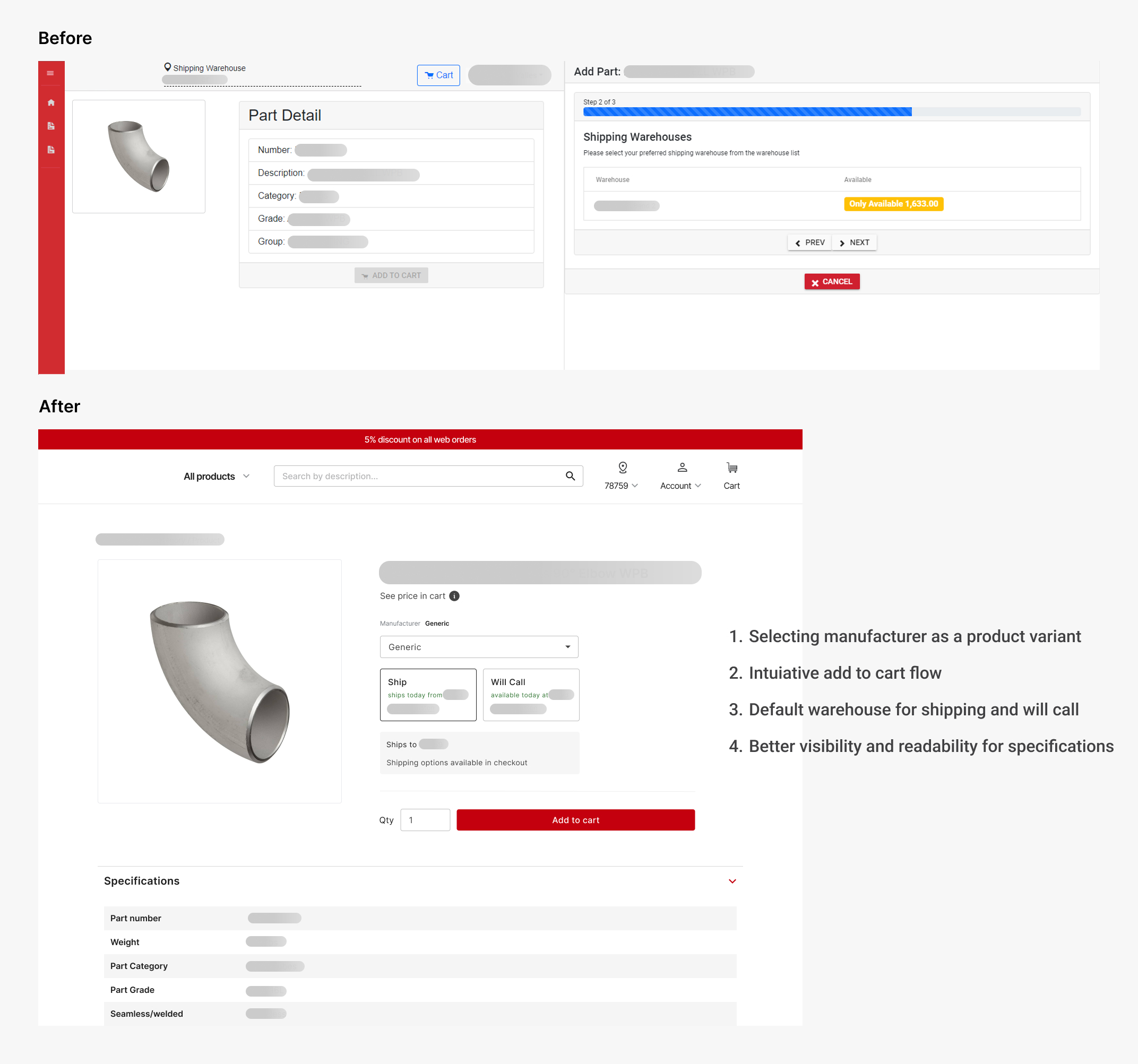
Buyers had to manually select warehouses and shipping details for each product across multiple pages, leading to high friction at a critical stage.


02. Complex Site Navigation

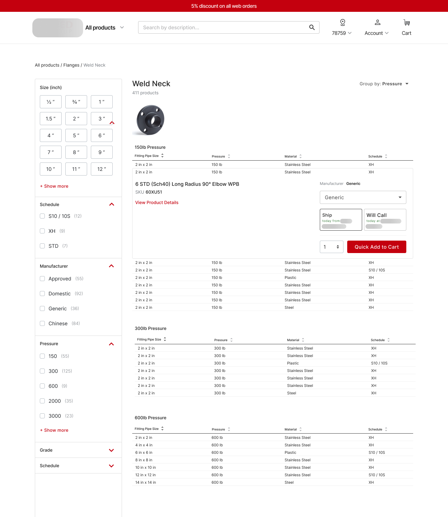
Product discovery was slowed down by a lack of clear hierarchy, buried product details, and no guided flow from browsing to checkout.


03. System Limitations and Edge Cases

There was no automation for frequent buyers. Repetitive tasks like selecting preferred warehouses and shipping addresses had to be done manually every time.

Streamlining a Complex B2B Checkout

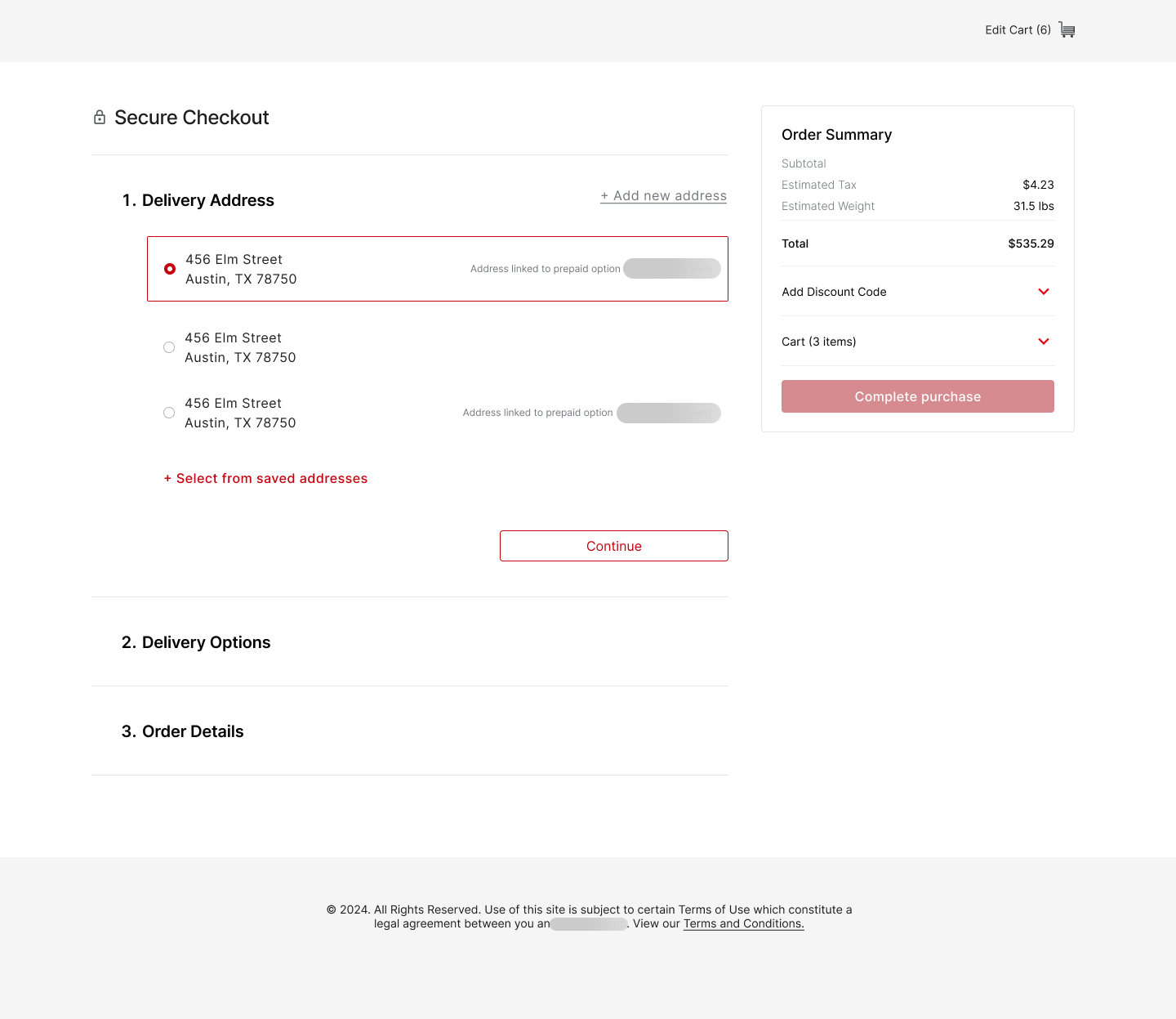
To address Allied Group’s high cart abandonment rates and buyer frustration, I redesigned the entire checkout flow with a focus on speed, clarity, and reduced manual input. Drawing from user research and journey mapping, the new experience prioritized efficiency for repeat buyers.

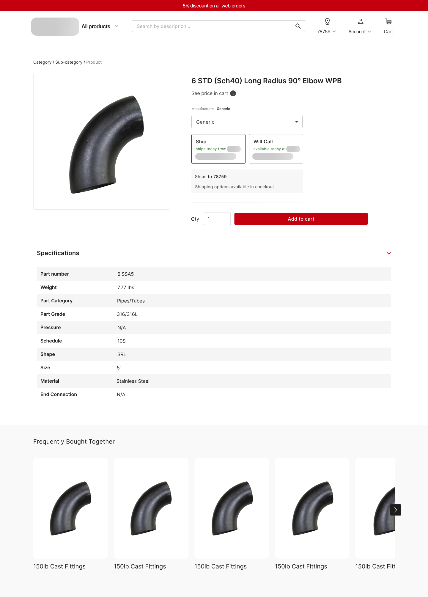
The updated flow included warehouse auto-selection based on previous orders, with override options via a pop-up — replacing multiple form fields. Product selection was integrated directly on the PDP using dropdowns, minimizing steps and decision fatigue.

I built and tested the flow using wireframes and interactive prototypes in Figma, refining the experience through stakeholder feedback and usability sessions. A modular design system ensured consistency across the platform and simplified future updates.

Graphic details

Validating the design

I ran usability testing with a group of frequent buyers to evaluate the redesigned checkout flow. Participants were asked to complete key tasks such as selecting products, choosing warehouses, and completing checkout. They were encouraged to think aloud, which helped surface friction points and moments of hesitation.

Key insights included:

  • - Buyers found the new flow faster and more predictable
  • - Automated selections reduced cognitive load
  • - Some warehouse options needed clearer placement and labeling


Based on this feedback, I made targeted UI refinements to improve clarity. The final design increased user confidence, reduced the need for customer support, and contributed to higher order completion rates.

Samples from the New eCommerce Experience

Graphic details

Graphic details

Graphic details

Graphic details

Graphic details

Adhering to Web Content Accessibility Guidelines (WCAG) was essential to ensure that the design catered to a wide range of user needs. This encompassed considerations like Interface Accessibility, Color Contrast, Inclusive Language, and Imagery.

From Concept to Implementation 

After validating the designs through user testing, I worked closely with product managers, developers, and stakeholders to ensure a seamless handoff and implementation. This included:

  • - Creating detailed specs and developer-ready documentation in Figma
  • - Delivering interactive prototypes to demonstrate flows and states
  • - Leading design reviews to align on edge cases and technical constraints
  • - Supporting implementation with post-handoff collaboration and QA input


The rollout didn’t just improve the user experience — it also reduced internal inefficiencies. With clearer logic and fewer manual steps, customer support inquiries dropped and the overall checkout flow became significantly faster and more reliable. The redesign enabled B2B buyers to complete orders with minimal friction, contributing to higher conversion rates and improved customer satisfaction.

Key takeaways from the project

Beyond strong feedback from users and stakeholders, this project highlighted several important UX principles in action:

- Impactful design can thrive within technical constraints.

Even with platform limitations, thoughtful UX decisions led to measurable improvements in speed, efficiency, and buyer satisfaction.

- Automation reduces friction at scale.

Smart defaults and pre-filled data significantly streamlined the checkout process, saving time for repeat buyers and reducing errors.