Project

20-30 Coliving

Role

Contract UX & Web Designer: discovery, user research, design, testing, development.

blog-post-image

Background

"20-30 Coliving, a startup dedicated to addressing the housing shortage for young adults through eco-friendly coliving spaces, aimed to create a more user-friendly website to enhance their application process. After conducting an in-depth analysis to uncover weaknesses in their current website, I developed and launched a redesigned site using Wix, customized to align with the client's preferences.

The result was a successful redesign of 20-30 Coliving's website, with user satisfaction increasing by 25%, and the perceived findability of information improved by 12%.
Defining the problem

To understand what the target audience needed and expected from the website, I conducted interviews with stakeholders to gather information about the current website usage. Additionally, I interviewed 5 users from the target group to validate the data and gain insights, and analyzed competitors in the market to get a better understanding of the industry.

Problem

Difficult manual application management and communication gaps clashed with a tech-savvy audience's expectations, necessitating streamlined processes and enhanced online engagement.

01. Cumbersome Application Management

Managing applications proved difficult due to excessive manual work. This inefficiency led to frustration among potential residents, hindered effective communication, and compromised user experience.


02. Communication Gaps and Misplaced Applications

Information was hard to find on the existing website, resulting in many inquiries via phone calls and other channels. Additionally, applicants struggled to locate the correct platform for submitting applications, leading to misplaced submissions. The lack of a cohesive and user-friendly online presence hindered effective communication.


03. Tech-Savvy Audience Unmet

The primary audience, mainly tech-savvy young adults, desired a smooth and effective online experience. However, the website's failure to meet these expectations hindered user satisfaction and engagement.

Transforming Challenges into Solutions

In response to the challenges, I created a comprehensive solution with the goal of enhancing user experience. This solution was driven by a keen understanding of the needs of a tech-savvy audience and the imperative to align with their expectations.

By introducing a user-friendly online platform, potential residents could submit applications digitally, eliminating the need for manual work and reducing frustration. To bridge communication gaps, I added the requested location information and enhanced social media presence for user discovery. This aimed to reduce the need for phone inquiries and make essential information more accessible. Additionally, I improved navigation and clarified the submission processes to prevent misplaced applications, resulting in a more efficient and effective means of communication.

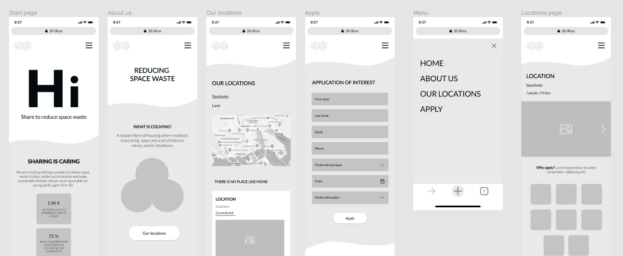
I integrated modern and user-friendly features, including simple interfaces and clear instructions. I worked on the designs by creating wireframes in Figma, refining them to achieve a visual experience that resonated effectively with the target audience. After fine-tuning the designs, I developed an interactive prototype for user testing purposes.

View prototype

Graphic details

Validating the design

I conducted user testing to validate whether the new designs would effectively address the identified issues. I selected a representative sample of the target group and conducted 5 usability tests.

During the testing I used a script that had users perform tasks such as finding a specific location and making an application of interest, while I observed their interactions with the prototype. They were also asked to "think-aloud" during the tests, helping me follow their process. The testing revealed some minor usability issues. Test participants pointed out that text in specific areas was challenging to read due to small font sizes. This impacted their ability to absorb information and navigate the site with ease. This valuable feedback underscored the significance of optimizing text readability and contrast in the final design, aiming for a seamless and user-friendly experience.

I struggle a bit when reading the information here
User

These findings helped me to make necessary adjustments to the design before final implementation. Overall the satisfaction of the website was rated high.

Creating Visual Identity

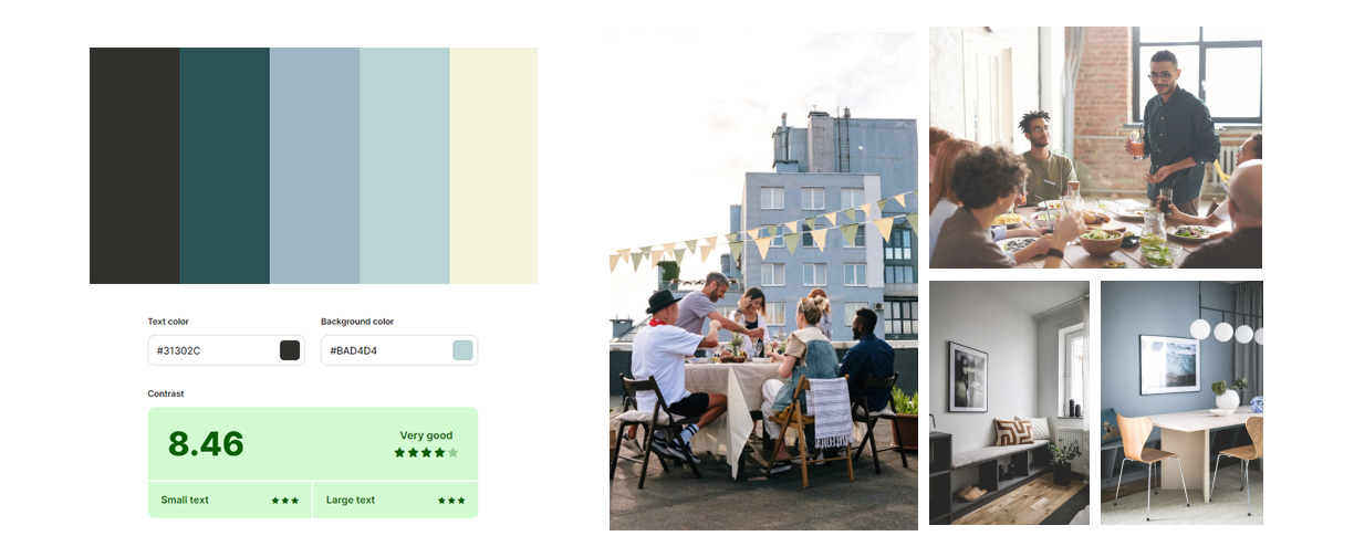
The color palette was chosen thoughtfully to resonate with the target audience, aiming for a genuine connection and a sense of belonging that defined 20-30's identity.

Every visual element and image was carefully designed to align with the core values of vibrant youthful energy, a strong sense of community, and a commitment to sustainable living. This tone strongly resonated with 20-30's dynamic and youthful demographic.

Graphic details

Adhering to Web Content Accessibility Guidelines (WCAG) was essential to ensure that the design catered to a wide range of user needs. This encompassed considerations like Interface Accessibility, Color Contrast, Inclusive Language, and Imagery.

From Blueprint to Browser

The prototype was transformed into a functional website using Wix, where I integrated interactions, graphic elements, and content. Overcoming the limitation of Wix's native responsive design capabilities, I devised and implemented strategies to ensure the website's seamless adaptation to diverse screen sizes while preserving its visual appeal.

Designs

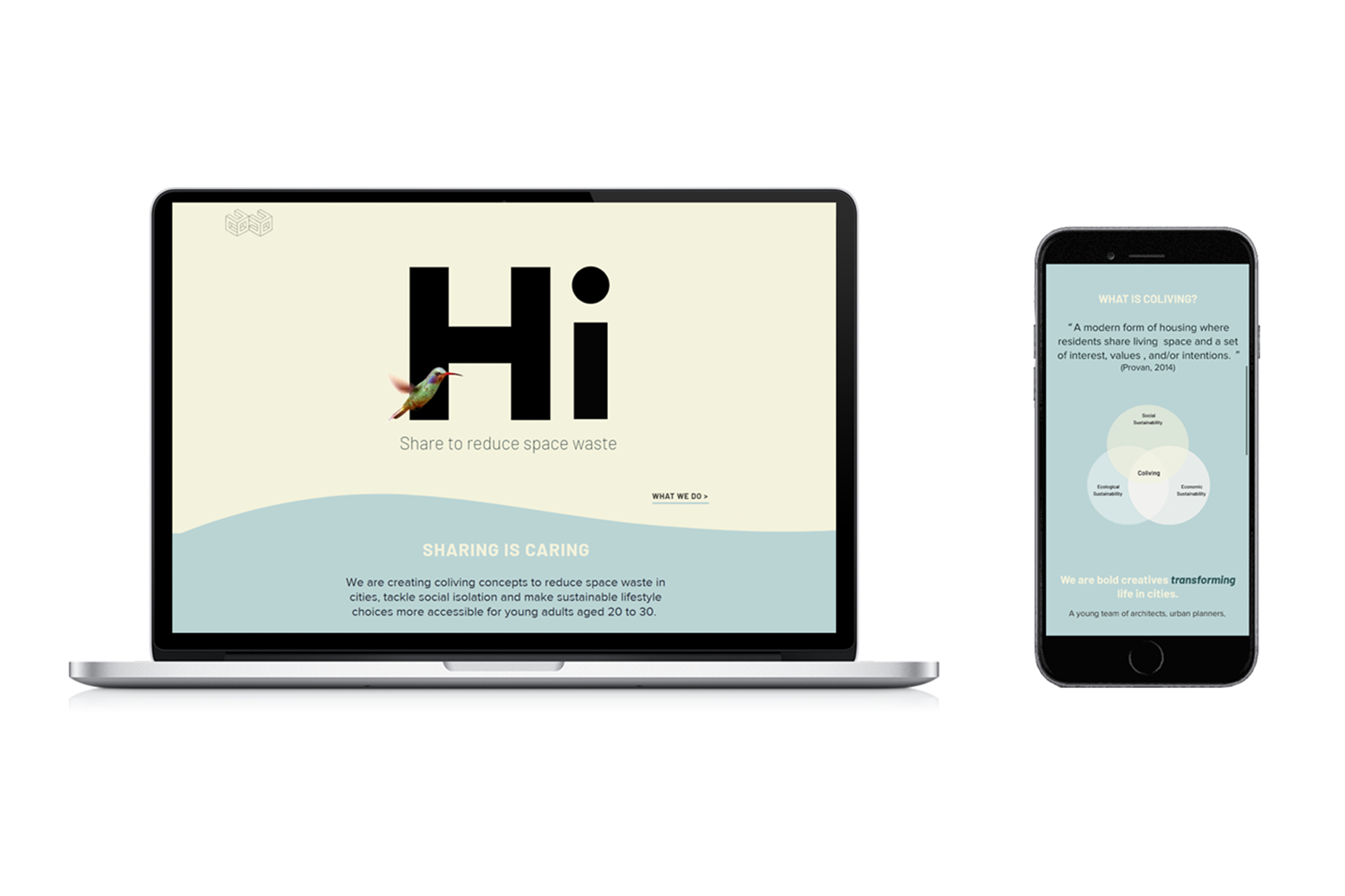
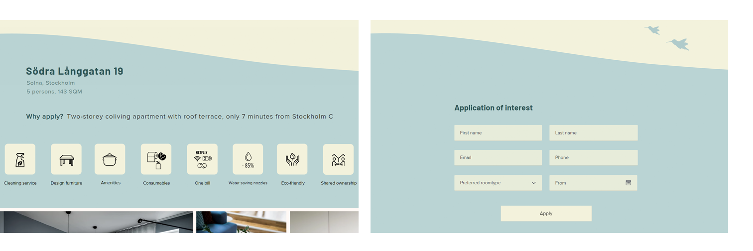
Following the successful implementation of the new design, 20-30 Coliving presents a markedly improved website, directly addressing the initial challenges identified.

The contact and application processes have been optimized, benefiting both users and the management team. Additionally, the website now showcases the company's sponsors, fostering improved business relationships. This transformation has yielded a website that aligns with user expectations, leading to increased engagement and satisfaction, contributing to a 25% increase in user satisfaction and a 12% improvement in the perceived findability of information.

Key takeaways from the project

In addition to receiving positive feedback from users and stakeholders some key takeaways are:

- Make it work using the resources at hand.

The project faced technical constraints as the client wanted to use Wix for building the website and retain editorial control internally. To overcome this limitation, I had to find creative solutions to ensure the best possible responsive design experience.